9 January 2019
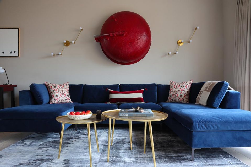
Neutral walls and flooring are punctuated by a primary color pop by way of art and accessories in this Chelsea penthouse designed by Elnaz Namaki and Hugo van Bilderbeek of HvB Development.
![]()
Think accent colors, layering and more
Each week Mansion Global tackles a topic with an elite group of designers from around the world who work on luxury properties. This week we look at how to make grey and beige anything-but-boring.
In the design world, shades of grey and beige are the ultimate neutrals. But they often come with a reputation for looking sterile.
However, there are many ways to use these colors and still create a space with personality.
To work with these shades to their best advantage, follow these tips from the pros.
“The easiest way to stop grey and beige from looking too neutral is by adding artwork and accessories that bring in other colors and textures. With neutral palettes, it is very important to layer the materials and colors through texture or patterns, otherwise spaces can feel flat and bland.
“Using dark and light iterations of these shades creates drama by way of a deeper contrast. When a room has high ceilings and plenty of natural light, grey/beige works well, as the volume and light already exist. If a room has limited natural light and proportions, however, then you need to play with contrasts, such as dark versus light, to create a warm atmosphere.
“Creating groups of accent colors that work well together for each area or space is important to avoid any clashing.” says Elnaz Namaki of London-based Elnaz Namaki Studio.