SOTHEBY’S INTERNATIONAL REALTY MAGAZINE
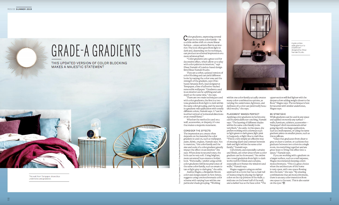
Color gradients, expressing several hues in the same color family—in a subtle ombre shift or a more linear fashion—create artistic flair in an interior. The look often goes from light to dark and, depending on the technique, can produce an ethereal impression or a more whimsical feel.
“Color gradients are a great tool for decorative effect, which allow us to play with color palettes in interiors,” says Elnaz Namaki of London-based design and build firm HvB x Elnaz Namaki.
They are a softer, updated version of color blocking and can yield different looks by varying the color tone and the strength of the gradient, says Ohio-based Amanda Both, lead designer at Tempaper, a line of adhesive-backed removable wallpaper. “Gradients used in an interior can be uplifting and add depth at the same time,” she says.
There are two main techniques used with color gradients; the first is a two-tone gradation from light to dark within the same color grouping, and the second is a gradient-mix application with tonally different colors, Namaki says. It “can be in either vertical or horizontal directions or an overall blend.”
Whether the method is used on a wall, accessories, or drapery, it’s one that makes a majestic statement.
Consider the Effects
The impression you create often depends on the material the color gradient is used on, such as wallpaper, paint, fabric, or glass, Namaki says. Not to mention, “the color family and the size and scale of a color gradient greatly impact the effect on an interior,” she says. When done in neutral tones, the look can be very soft. Using brighter, more saturated hues creates a bolder look. “Personally, I prefer using subtle color gradients within neutral tones of the same color family, such as cream to tan or light gray to dark gray,” she adds.
Andrea Magno, a Benjamin Moore color and design expert in New Jersey, suggests using a monochromatic color scheme with varying hues within one particular shade grouping. “Working within one color family actually creates many color-combination options, as varying the undertones, lightness, and darkness of a color can yield really beautiful results,” she says.
Placement Makes Perfect
Applying color gradients in bathrooms can be particularly eye-catching, Namaki says. “The layering of different shades within the same color family looks very fresh,” she adds. In this space, she prefers working with colorways such as light green to dark green, light pink to burgundy, or light blue to dark blue. “This is a very simple yet effective way of creating depth and contrast between dark and light within the same color family,” Namaki says.
Upholstery, and especially curtains and blinds, are other areas where a color gradient can be showcased. “An ombre two-toned gradation from light to dark works well for blinds and curtains, especially as it frames the windows and walls,” Namaki says.
Magno suggests using an ombre approach in a room that has a chair rail or wainscoting by placing the lighter color on the top portion of the walls, a midtone on the lower half of the wall, and a darker hue as the base color. “The upper section will feel lighter with the deeper colors adding weight closer to the floor,” Magno says. The technique is best for neutrals with similar undertones, Magno says.
Be Strategic
While gradients can be used in any space and applied on mostly any surface—walls, furniture, cabinets, accessories—Tempaper’s Both recommends either going big with one large application, such as a wall expanse, or using the same gradient prints on smaller pieces, such as throw pillows.“Glass that graduates from clear to gray or clear to amber, or cushions that graduate between two colors in a single room, tie everything together and are great ways to bring this effect into a space,” Namaki says.If you are working with a gradient on a larger surface, such as a wall expanse, Magno recommends keeping colors monochromatic. “This is a great choice when the architecture of the home is very open, with one space flowing into the next,” she says. “By creating combinations that are monochromatic, there is an easy color transition from one space to the next. This is also easier on the eyes.”


